


Ocean Conservative required clear, digestible communication materials across digital and print platforms. The challenge was translating dense, information-heavy content into visually structured, accessible formats that maintained clarity and professionalism.
My role focused on simplifying complex information while preserving hierarchy, readability, and visual cohesion.
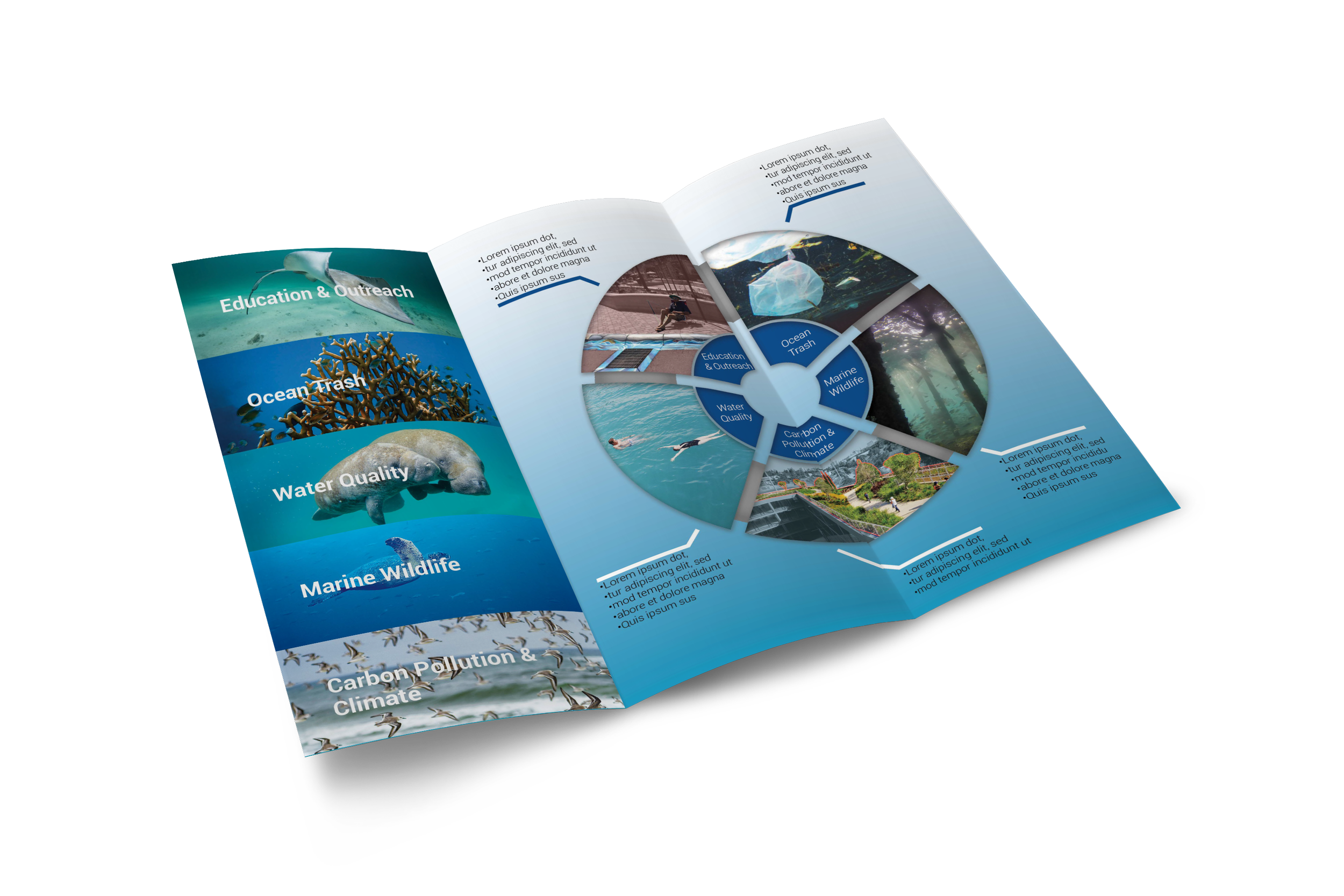
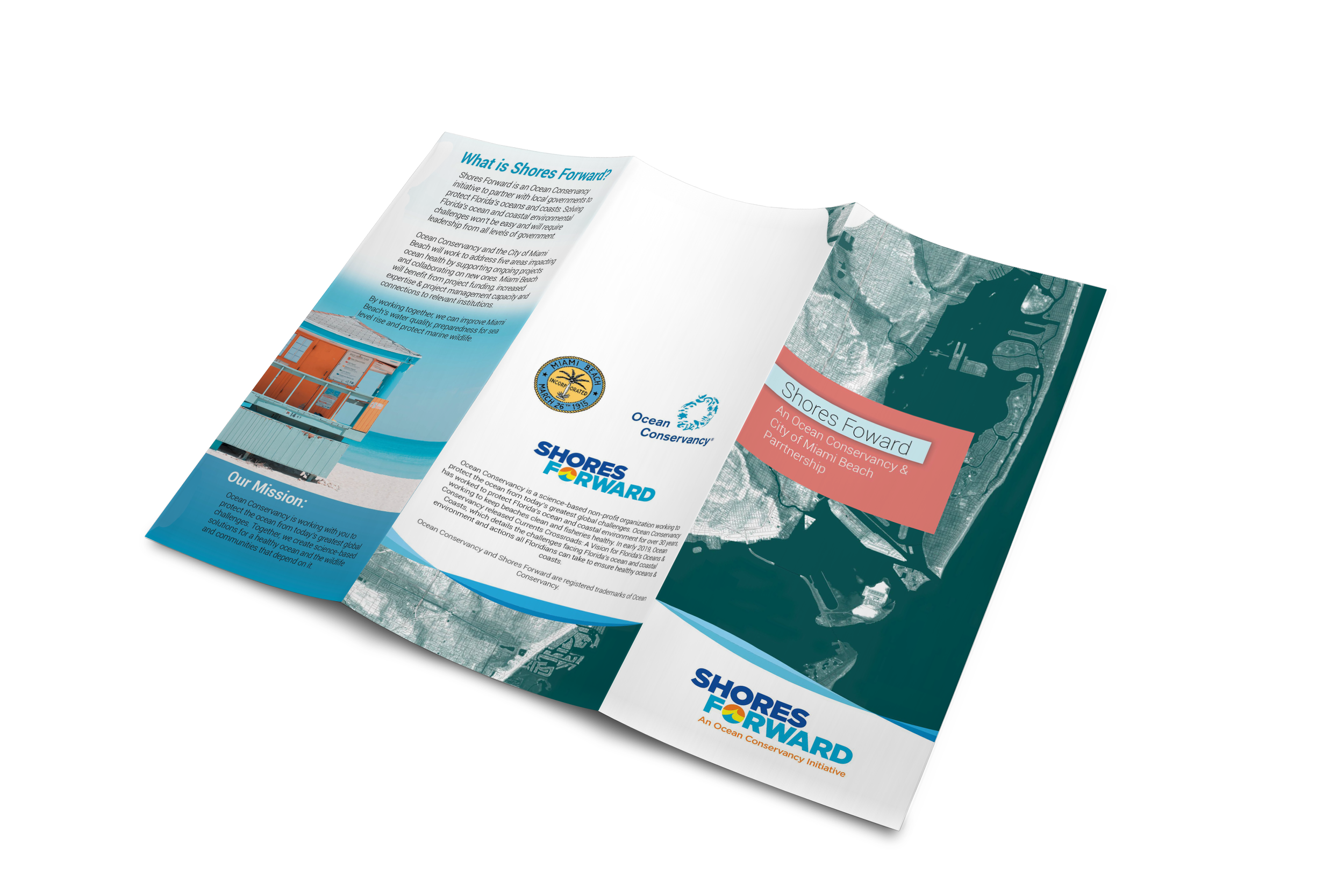
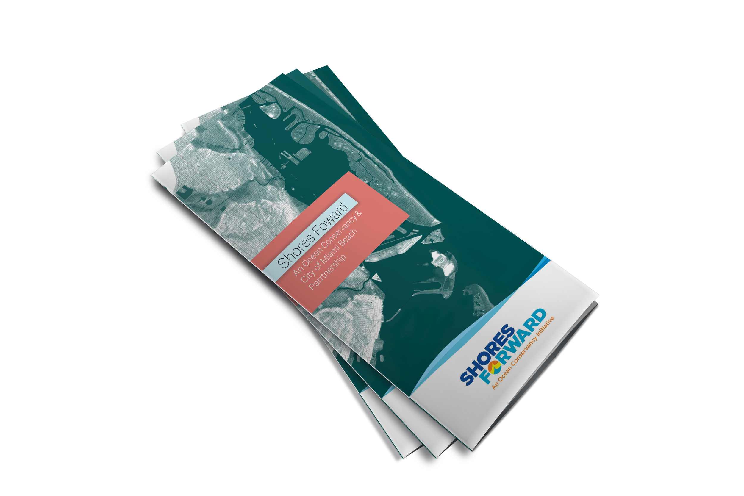
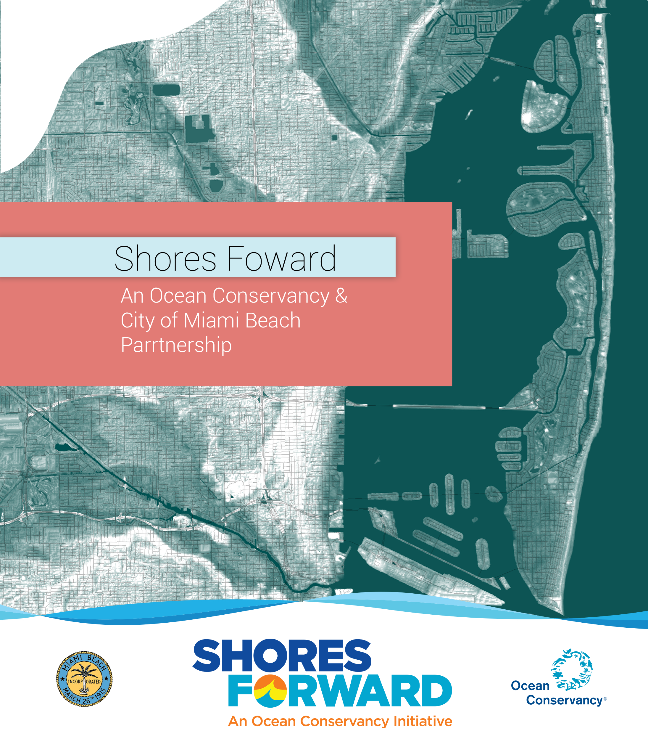
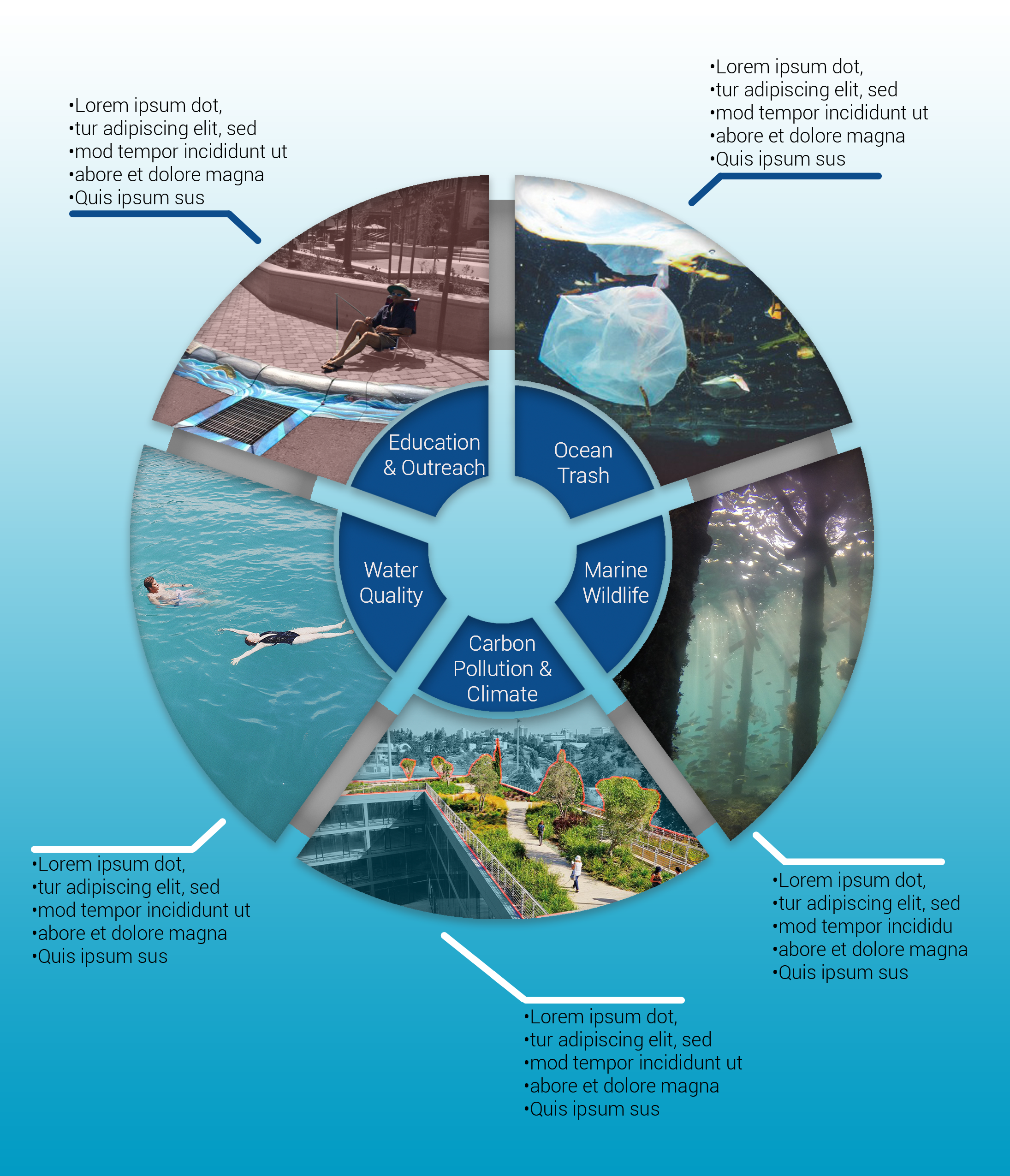
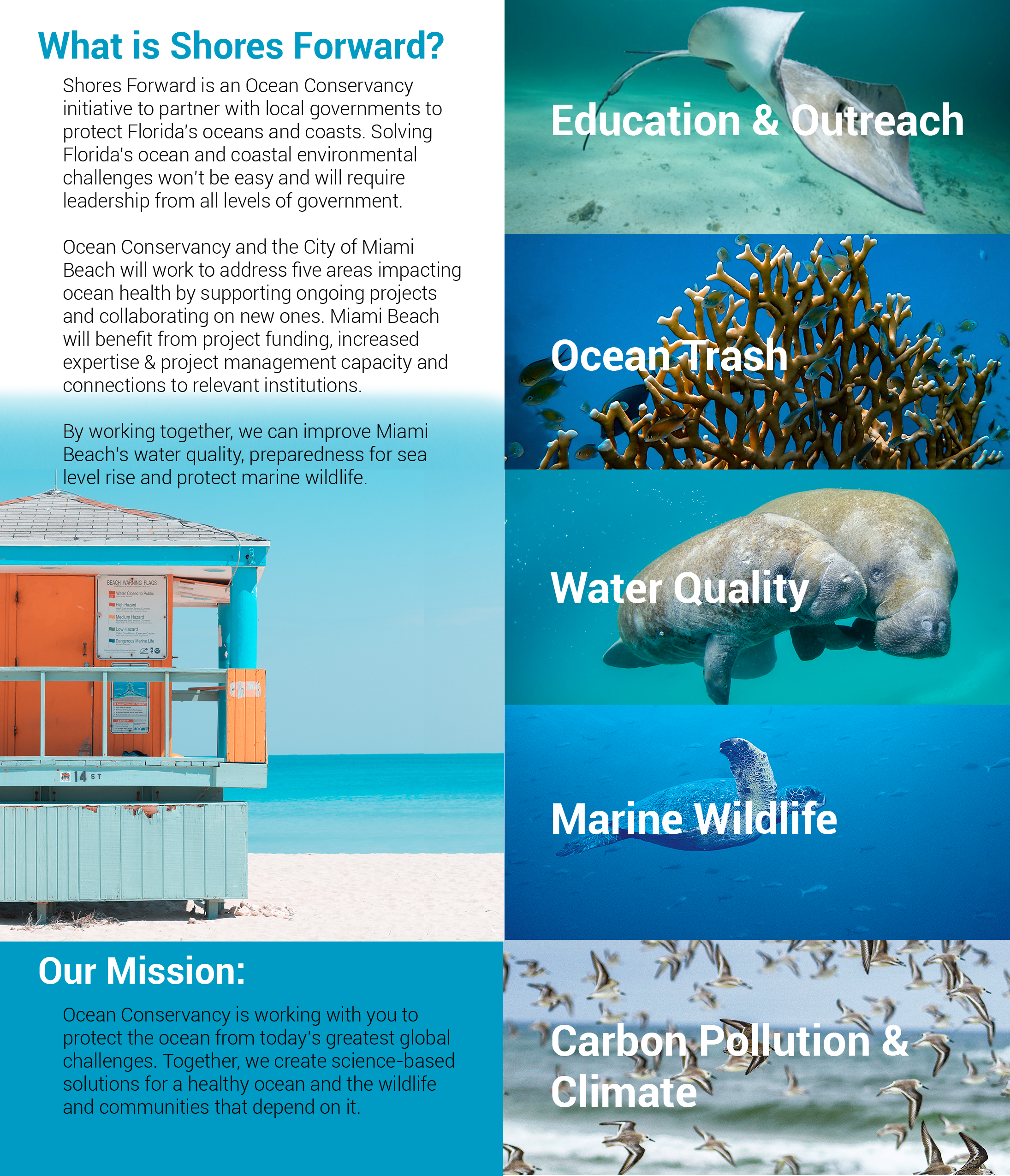
Print Adaptation: 40 Page Booklet - Trifold
One of the primary challenges was compressing a 40-page informational booklet into a concise trifold brochure without losing core messaging.
This required:
Strategic content reduction and prioritization
Clear sectioning and information hierarchy
Visual restructuring for scannability
Thoughtful use of spacing and typography
Email Design
The objective was to create a clean, structured layout that allowed readers to quickly understand key messages without feeling overwhelmed.
Designed a responsive, visually balanced email layout
Established typographic hierarchy for clarity
Integrated brand colors and visual consistency
Structured content for engagement and readability
The result was a streamlined communication piece designed for both desktop and mobile viewing.
Social Media Carousel (3 Slides)
To extend reach digitally, I designed a 3-slide social media post that distilled the core messaging into concise, engaging visuals.
Slide 1: Attention-grabbing headline
Slide 2: Key data or message breakdown
Slide 3: Clear call-to-action